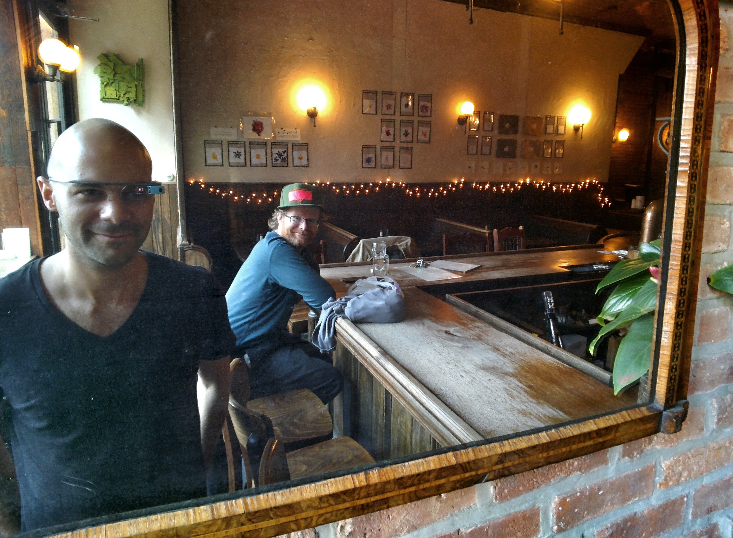
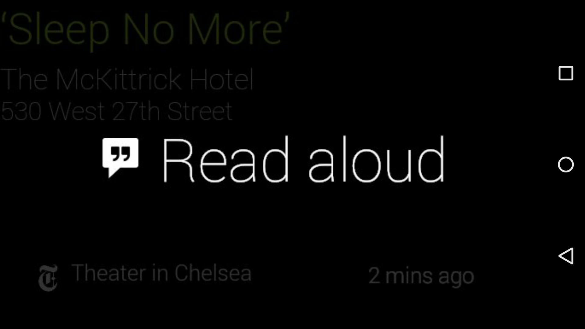
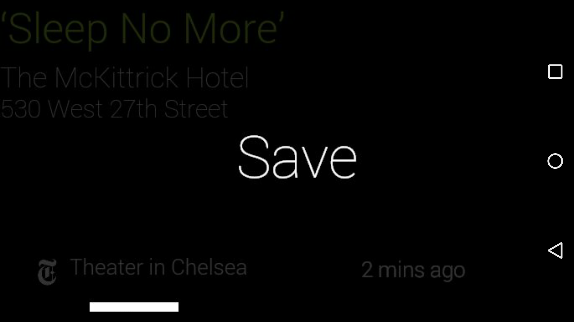
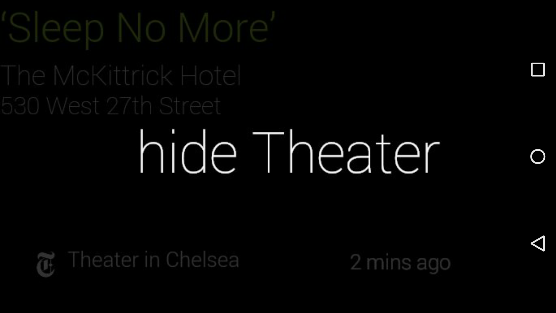
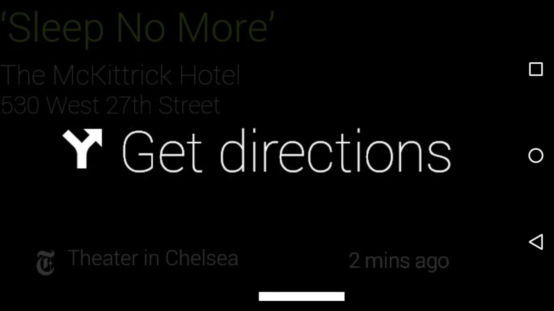
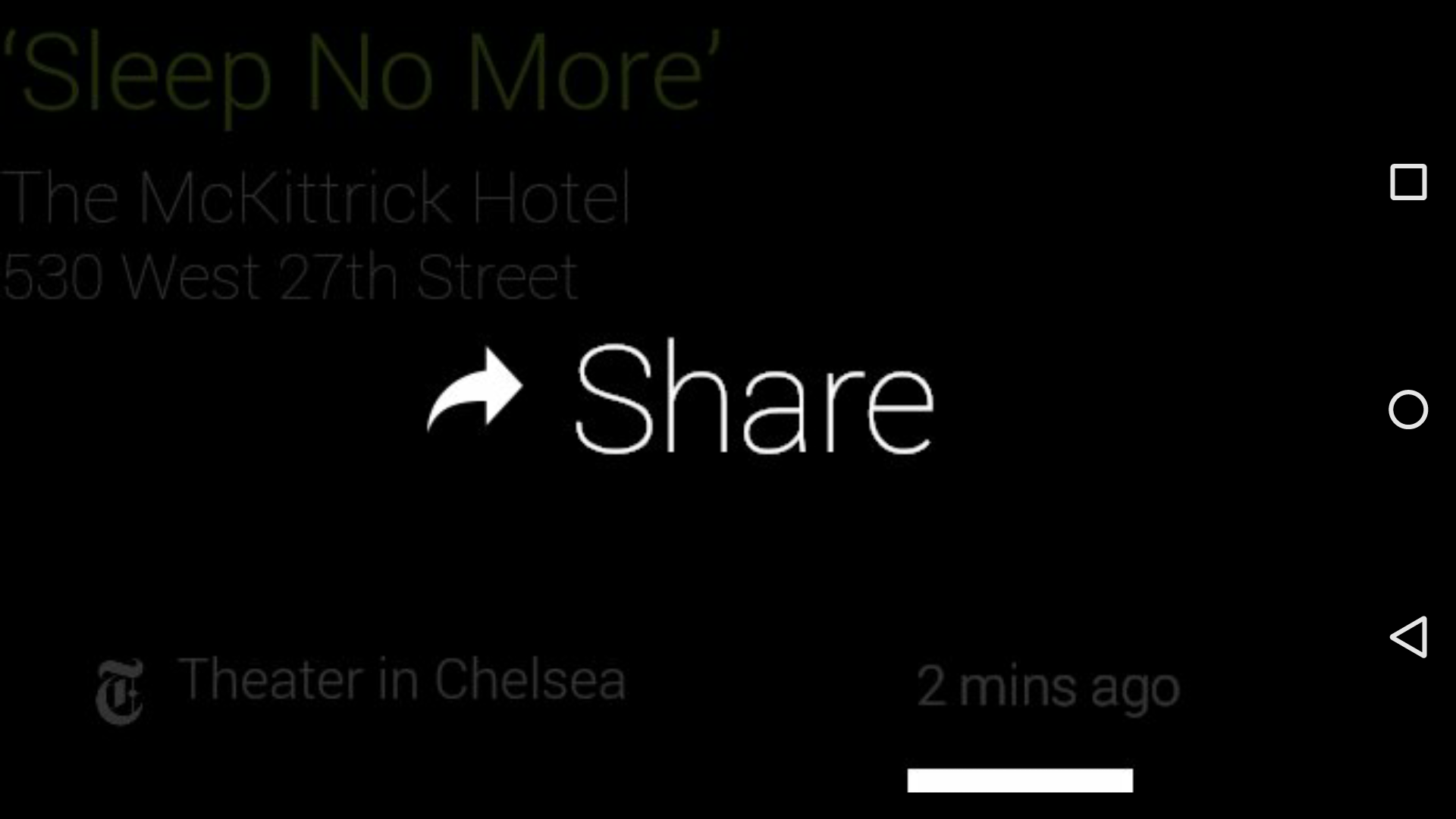
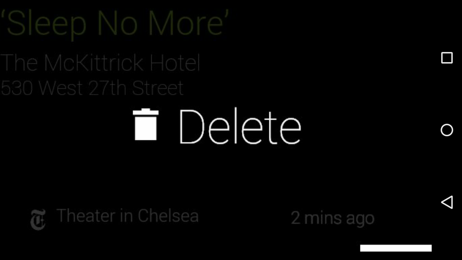
I designed and prototyped an experimental Google Glass app for nytlabs. The app’s focus was, counterintuitively, on dissapearing into the user’s situational awareness: to become, in a way, an ambient or environmental sense.
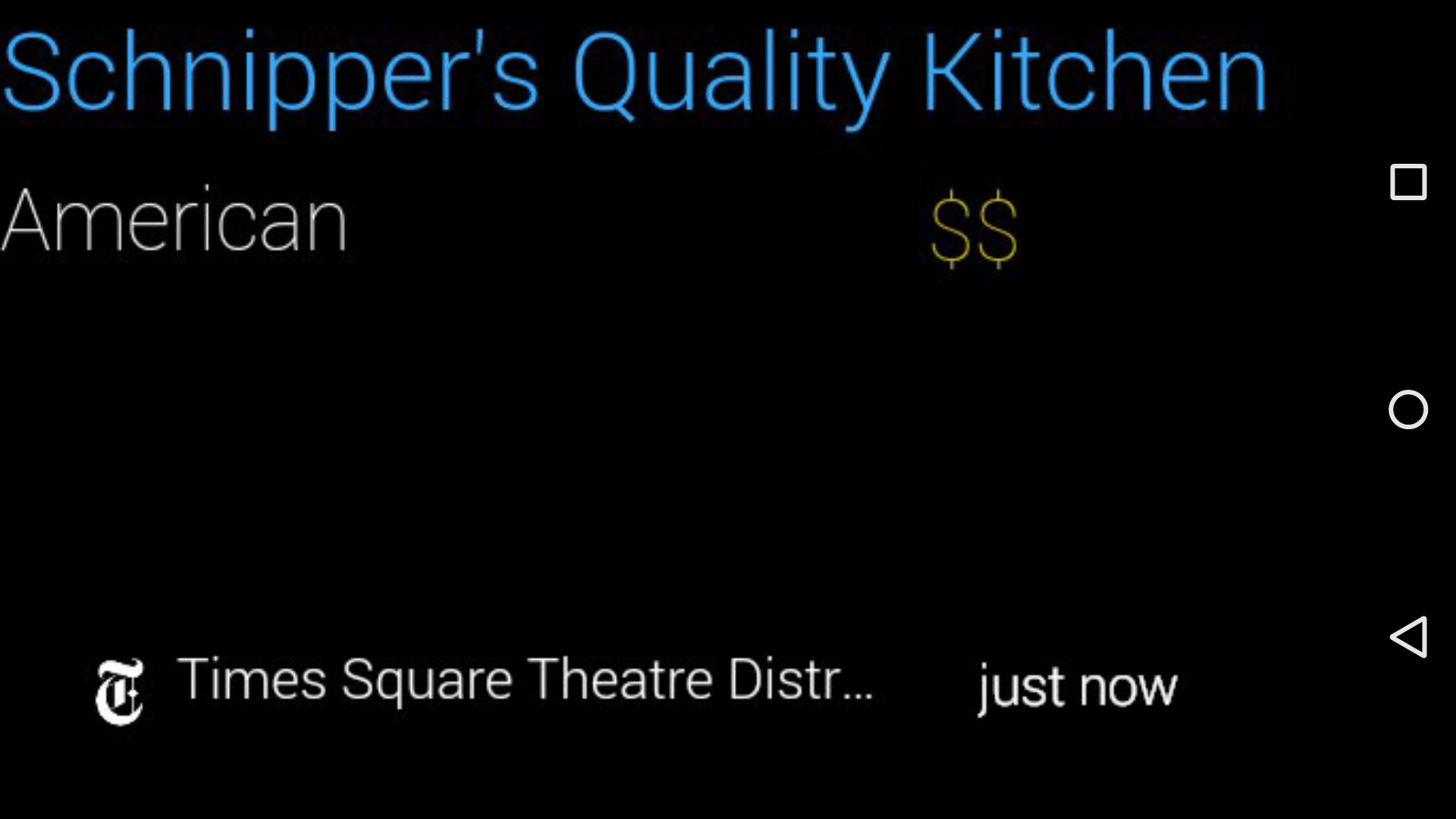
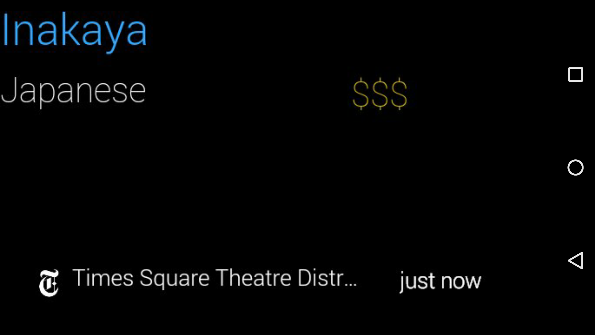
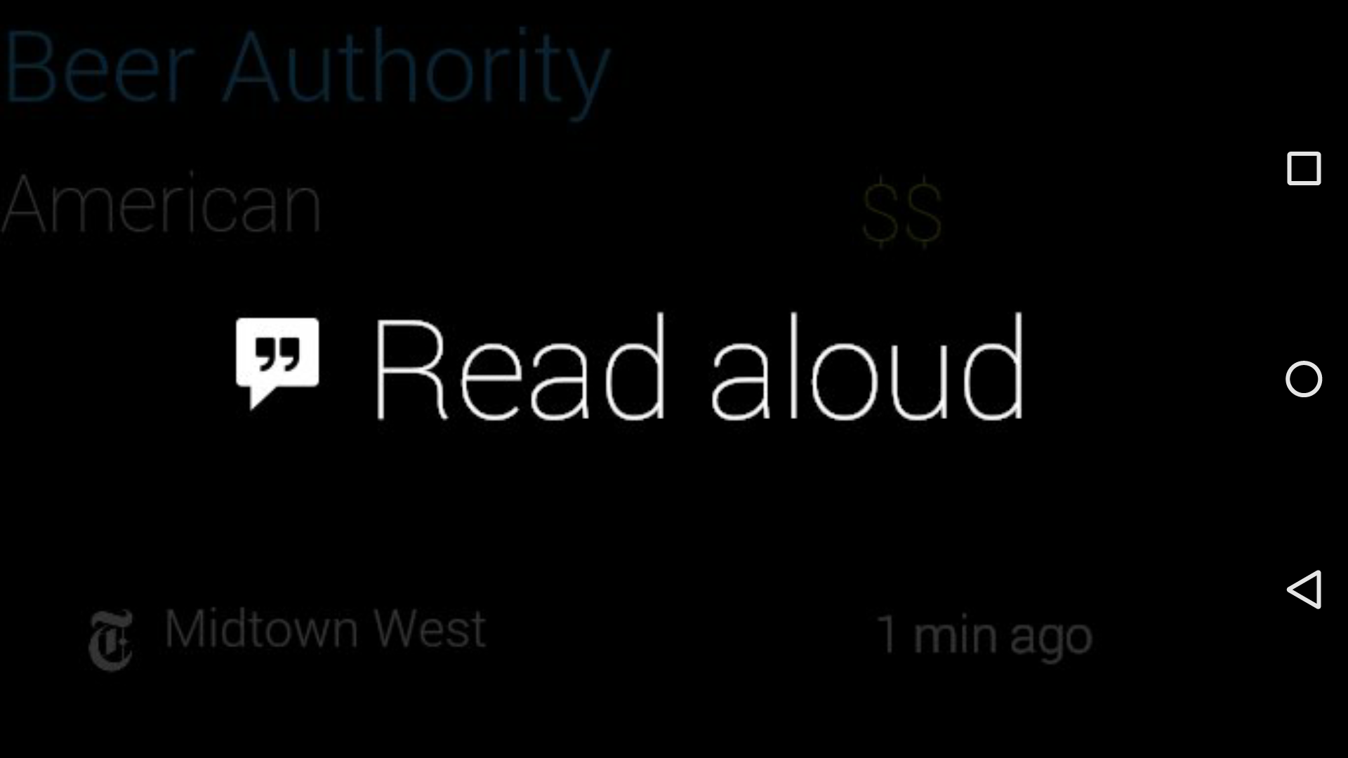
The app would surface nearby well-reviewed restuarant and theatrical venues when the Glasshole was near them. Notably, the UX was designed strongly to privilege the wearer’s focus, rather than the app’s often-flawed “engagement” metrics. When the app surfaced a suggestion, the easiest/fastest responses were always remedial: the option to dismiss a restaurant suggestion forever or, expanding upon that, the option to nix a whole category of restuarant or theatrical event.
The result of this thoughtful UX is that the app quickly stops surfacing new notifications within the first week or so of use: after it has learned your tastes, it only notifies you when there’s a strong chance you’d be interested in the surfaced suggestion…
